 DripTick
A client onboarding form sounds simple.
You make a list of questions, put them into a form builder, send the link to your new client, and wait for the answers.
Except that's usually where things go wrong.
The form gets longer.
More questions get added.
Someone remembers another piece of information they need.
Then another.
Eventually, the client opens the form and sees what feels like a small administrative project waiting for them.
So they close it.
You send a reminder.
They say they'll get to it.
A few days later, you send another reminder.
And suddenly your "streamlined onboarding process" has created exactly the email back-and-forth you were trying to eliminate.
A good client onboarding form should do something different.
It should help you start the project with clarity while making it easy for the client to provide what you need.
The goal isn't to ask every possible question.
The goal is to ask the right questions, in the right order, at the right time.
What is a client onboarding form?
A client onboarding form is a structured form used to collect the information you need after a client decides to work with you and before, or as, the project begins.
Depending on your business, it might collect:
- business information
- project goals
- requirements
- target audience
- preferences
- timelines
- stakeholders
- files and assets
- communication preferences
- existing tools or resources
- other information needed to deliver the work
A client onboarding form is sometimes called a:
- client intake form
- client intake questionnaire
- onboarding questionnaire
- new client questionnaire
- client discovery form
- project intake form
The names vary, but the purpose is broadly the same:
Turn what you need to know about a new client and project into structured information you can actually use.
That last part matters.
A form isn't successful simply because somebody submitted it.
It's successful when the information inside it helps you make better decisions, prepare for the project and avoid unnecessary back-and-forth.
Client onboarding form vs. contact form vs. questionnaire
These terms are often used interchangeably, but they don't have to mean the same thing.
Contact form
A contact form usually answers:
"How can I get in touch with you?"
It might contain:
- Name
- Phone
- Message
That's enough for an enquiry.
It usually isn't enough to onboard a client.
Client intake form
An intake form goes deeper.
It might answer:
"Who is this client, what do they need, and what do we need to know to move forward?"
It could include:
- business information
- project type
- goals
- requirements
- timeline
- budget
- assets
- stakeholders
Client onboarding form
An onboarding form usually happens after the engagement is moving forward.
Its purpose is to prepare the relationship and project for delivery.
That might mean collecting:
- project details
- preferences
- access requirements
- assets
- communication expectations
- success criteria
- information needed for kickoff
There can be overlap between intake and onboarding.
The important thing isn't what you call the form.
It's what job the form is doing.
The biggest mistake: building the form around everything you want to know
This is where many client intake forms go wrong.
You think:
"While I'm asking about their business, I might as well ask about their competitors."
Then:
"I should probably ask about their target audience."
Then:
"Maybe I should ask about their brand voice."
Then:
"Oh, and let's ask what they like and dislike."
Before long, you have a 30- or 40-question form.
And technically, every question might be useful.
But that doesn't mean every question belongs right now.
A better rule is:
Every question should have a reason to exist.
Before adding a question, ask:
What will I do with this answer?
If the answer doesn't affect:
- project scope
- project decisions
- preparation
- communication
- delivery
- risk
- kickoff
- or the client's experience
then consider removing the question.
The "what will I do with this?" test
Imagine you're building a website for a new client.
You could ask:
What is your favourite colour?
Maybe that's useful.
But:
Do you already have established brand colours?
is probably more useful.
You could ask:
What websites do you like?
Better:
Which websites do you consider good examples of the style or experience you're looking for?
Even better:
Please provide up to three websites you like and tell us what you like about each one.
The difference is subtle.
You're not merely collecting information.
You're designing questions to produce useful information.
Start with the outcome, not the questions
Before opening your form builder, write down:
"What do I need to know before I can confidently begin this project?"
Then divide the answer into categories.
For many service businesses, a useful starting structure is:
- Client and business information
- Project context
- Goals and desired outcomes
- Audience or customers
- Requirements and scope
- Preferences and references
- Timeline and priorities
- Stakeholders and approvals
- Files and assets
- Additional information
You won't necessarily need all ten.
That's the point.
The structure gives you somewhere to start without automatically turning every category into ten questions.
A practical client onboarding form structure
Here's a framework you can adapt.
Section 1: About the client
Keep this relatively short.
You may need:
- Full name
- Company/business name
- Email address
- Phone number
- Website
- Role/job title
- Location, where relevant
Some of this information may already be known from your proposal, CRM or initial enquiry.
If you already have it, don't ask the client to provide it again just because your form has a field for it.
Reducing duplicate questions is one of the easiest ways to make an onboarding form feel shorter.
Section 2: About the project
Now establish what you're actually working on.
Useful questions might include:
What are we working on together?
Use a clear selection where possible:
- Website
- Branding
- Marketing
- Consulting
- Coaching
- Content
- Development
- Other
Then:
Briefly describe what you'd like us to help you with.
Follow that with:
What prompted you to start this project now?
That second question can be surprisingly useful.
"Build a new website" is a requirement.
"Convert more visitors because our current website no longer represents the business" gives you context.
Section 3: Goals and desired outcomes
Don't settle for:
What are your goals?
It's too broad.
You'll often get:
"Grow the business."
Instead, break the question down.
What would you most like this project to accomplish?
What is the most important outcome?
How will you know the project has been successful?
Is there a particular problem you're hoping this project will solve?
These questions move the conversation away from:
"What do you want us to make?"
toward:
"What are you trying to achieve?"
That distinction can significantly improve the quality of the project.
Section 4: Audience and customers
This section is particularly useful for marketing, design, consulting and web projects.
Possible questions:
Who is the primary audience for this project?
What do you already know about them?
Are there different customer groups we should consider?
What problems are your customers trying to solve?
Are there particular audiences you want to attract more of?
Again, don't ask all of these automatically.
Choose the questions that actually influence the work.
Section 5: Requirements and scope
Now get specific.
For example:
What does the project need to include?
Use checkboxes or multiple selections where appropriate.
For a website:
- Home page
- About page
- Services
- Contact
- Blog
- Portfolio
- Ecommerce
- Booking
- Other
Then:
Are there any features, integrations or requirements we should know about?
And:
Is there anything that must be included for the project to be considered complete?
That last question is particularly useful because it gives you an opportunity to identify hidden requirements.
Section 6: Preferences and references
This is where you can collect subjective information without turning the form into an essay.
Instead of asking:
"Tell us everything you like."
Try:
Are there examples you like that we should look at?
Then:
What do you like about those examples?
You might also ask:
Is there anything you definitely don't want?
This is a powerful question.
Knowing what the client doesn't want can be just as valuable as knowing what they do.
Section 7: Timeline and priorities
Don't simply ask:
When do you want this done?
Ask why.
For example:
Is there a specific date or event driving the project timeline?
Then:
Are there any deadlines we should be aware of?
And:
Which parts of the project are most important if priorities need to change?
This helps separate:
"We'd like it soon."
from:
"The new site needs to launch before our conference on October 15."
Those are very different project constraints.
Section 8: Stakeholders and approvals
This is one area I think deserves considerably more attention than it gets in generic intake templates.
A project can have an excellent brief and still become difficult because nobody established who makes decisions.
Ask:
Who will be our primary point of contact?
Then:
Who will provide final approval?
And, if necessary:
Who else will be involved in reviewing the work?
You can also ask:
How does your team normally make decisions about projects like this?
For agencies and larger clients, this information can prevent a tremendous amount of confusion later.
Recent agency onboarding surveys are increasingly emphasizing the approval chain specifically because unclear decision-making can become a major source of revisions and delays.
Section 9: Files and assets
If you need files, make the process obvious.
Depending on your service, this might include:
- Logos
- Brand guidelines
- Images
- Existing copy
- Documents
- Product information
- Reference files
- Previous designs
- Existing reports
Instead of:
"Please send all relevant files."
be specific.
For example:
Upload your current logo files.
Upload your brand guidelines, if available.
Upload any existing documents or assets that will help us understand the project.
Specific requests are easier to complete.
Be careful with access and passwords
Some projects require access to:
- websites
- analytics
- advertising platforms
- social accounts
- hosting
- other software
But a client onboarding form should not become a password collection system.
Don't ask clients to paste passwords into ordinary form fields.
Instead, use a secure access-sharing method appropriate to the service.
Your form can simply ask:
Which accounts or systems will we need access to?
Then handle the actual access separately.
That keeps the onboarding form focused on information gathering, rather than turning it into a repository for secrets.
Section 10: Anything else we should know?
It's useful to have one final open-ended question.
For example:
Is there anything else you think we should know before we begin?
This gives the client somewhere to mention something you didn't anticipate.
But keep this at the end.
Don't make every important requirement depend on a giant text box labelled:
"Tell us everything."
Structured questions are easier to answer and easier for you to use.
How many questions should a client onboarding form have?
There's no magic number.
You will find plenty of templates recommending 15 questions, 25 questions, 27 questions, 40 questions or more. Current search results are full of these numbered templates.
But the better question is:
How much effort does this form require from the client?
A 25-question form containing mostly dropdowns and short selections may be easier than a 12-question form containing twelve giant essay boxes.
So instead of optimizing for the number of questions, optimize for:
Relevance
Does the question matter?
Effort
How difficult is it to answer?
Sequence
Are you asking it at the right time?
Clarity
Does the client understand what you're asking?
Value
Will the answer actually change what you do?
That's a much better framework.
Don't make every question required
This is another common mistake.
If everything is required, the client may get stuck on something they don't know.
Instead, distinguish between:
Required
Information you genuinely need before moving forward.
Optional
Useful context, but not essential.
Conditional
Only relevant if the client selects a particular answer.
For example:
Do you already have brand guidelines?- Yes / No
If they select:
Yes
show:
Upload your brand guidelines.
If they select:
No
there's no reason to show the upload field.
That's a much better experience than showing every possible question to every client.
Use conditional logic to keep forms relevant
Conditional logic is one of the most useful ways to reduce form complexity.
Imagine you're an agency working with:
- ecommerce businesses
- service businesses
- SaaS companies
You don't need to ask every client the same questions.
Start with:
What type of business do you operate?
If they select:
Ecommerce
show questions about:
- ecommerce platform
- product catalogue
- checkout
- payment systems
If they select:
SaaS
show questions about:
- product
- target users
- subscription model
- integrations
If they select:
Service business
show questions about:
- services
- lead generation
- booking
- service areas
The client experiences a form that feels personalized to their situation.
You get more relevant information.
And the form can remain comprehensive without displaying everything to everyone.
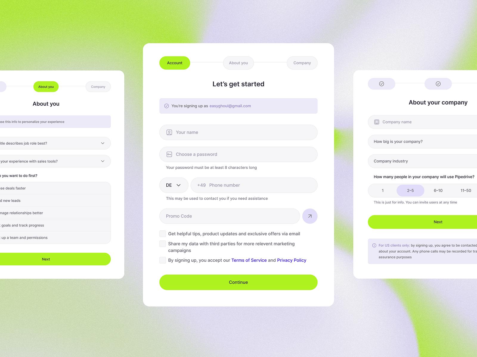
When should you use a multi-step form?
Conditional logic isn't the only way to reduce perceived complexity.
Sometimes you simply have several logical groups of questions.
For Example:
Step 1
About your business
Step 2
Your project
Step 3
Your audience
Step 4
Requirements
Step 5
Assets
Instead of showing everything on one long page, the client progresses through the sections.
This can make a substantial form feel more manageable.
But don't use multiple steps simply because they look impressive.
A five-question form doesn't need five screens.
Use multiple steps when:
- the form is genuinely long
- questions naturally fall into sections
- different stages require different thinking
- you want to create a guided process
- conditional branching makes a single-page structure confusing
The objective is always the same:
Reduce cognitive load without hiding important information.
Write questions the way a client thinks
This is surprisingly important.
Compare:
Please provide your organization's primary strategic objectives.
with:
What are you hoping this project will help you achieve?
The second sounds like a conversation.
That's what you want.
Similarly:
Instead of:
Please provide details regarding your preferred communication cadence.
Try:
How would you prefer we communicate during the project?
Then give choices:
- Scheduled calls
- Project messages
- Other
Good onboarding forms don't feel like legal paperwork.
They feel like a structured conversation.
Use the right field for the answer
Don't make everything a text field.
If you need one choice:
Radio buttons / single selection
If multiple choices are possible:
Checkboxes
If there are many predefined options:
Dropdown
If you need a short piece of information:
Short text
If you genuinely need an explanation:
Long text
If the client needs to provide a document:
File upload
If you need a date:
Date field
This sounds obvious.
But a form with fifteen open-ended text boxes puts unnecessary work on the client and makes the resulting information harder to process.
Don't turn every answer into an essay
One of the easiest ways to make a form feel exhausting is to ask:
"Please explain..."
over and over.
Instead, use structure.
For example:
What are your main project goals?
Select up to three:
Generate more leads
Improve conversion
Improve brand perception
Launch something new
Reduce manual work
Other
Then:
Anything else you'd like us to know about your goals?
Now the client can provide detail if necessary.
You're giving them both:
structure + flexibility.
Build different forms for different moments
Another mistake is trying to create one giant master onboarding form that handles the entire client relationship.
You may be better off separating the process.
For example:
Initial client intake
Collect:
- business
- goals
- project
- scope
- timeline
Discovery questionnaire
Collect:
- audience
- positioning
- preferences
- competitors
- references
Asset collection
Collect:
- files
- documents
- images
- brand materials
Approval form
Collect:
- approval
- feedback
- final decisions
The client doesn't necessarily need to see all of these at once.
And you don't necessarily need to build all of them.
The right structure depends on your process.
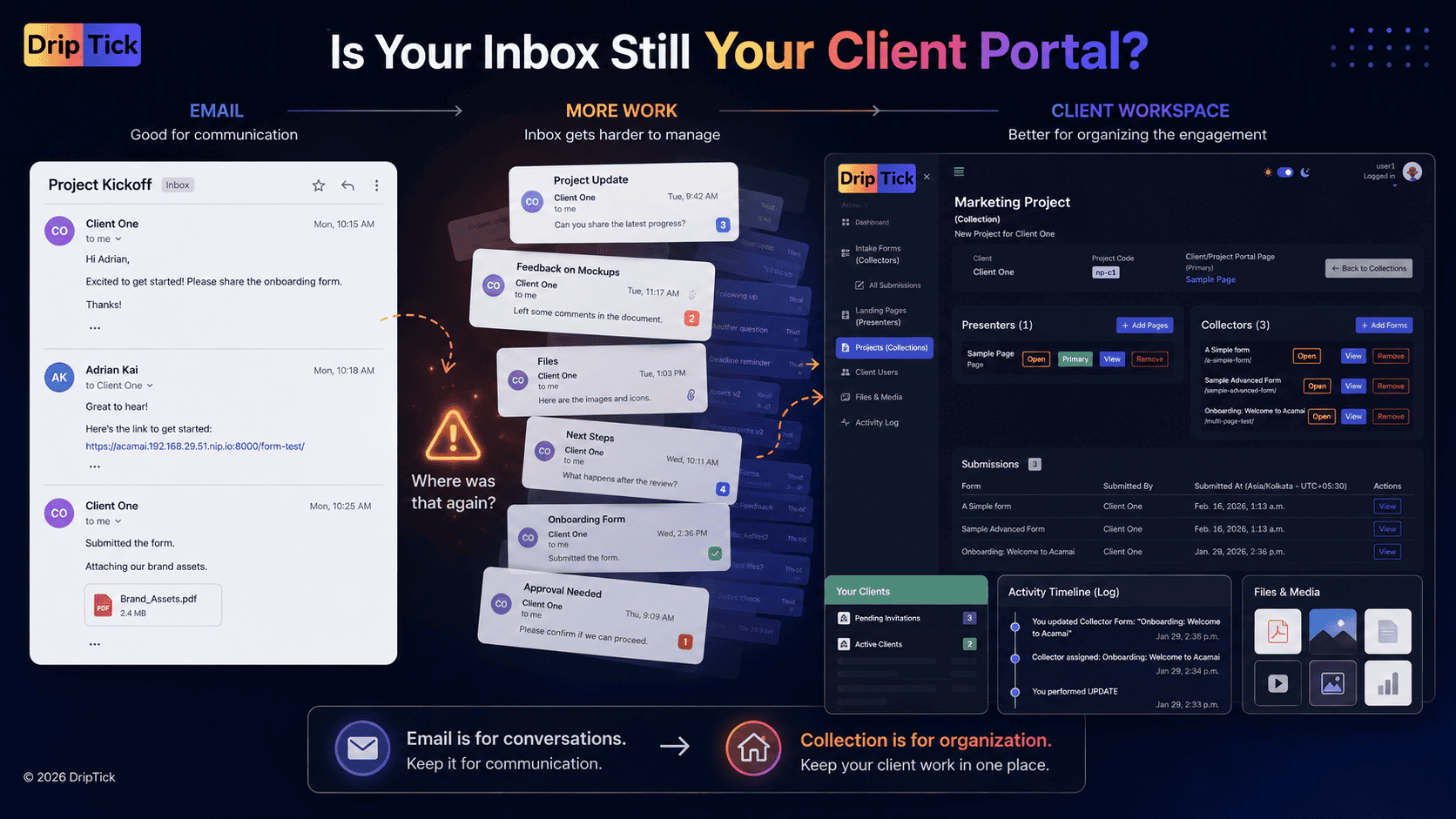
A client onboarding form should feed the project—not disappear into an inbox
This is the part that often gets overlooked.
You can build a beautiful form.
The client can complete it perfectly.
But then what happens?
If the submission lands in an inbox and you manually copy important information into another system, you've solved only half the problem.
The useful information should become part of your workflow.
For example:
Client submits form
↓
Information becomes available to the project
↓
You review the submission
↓
Outstanding questions are identified
↓
Kickoff uses the information already collected
↓
Project begins
This is why we think about a client onboarding form as an information layer, rather than simply a questionnaire.
Example: a website-design onboarding form
Let's make this practical.
Imagine you're a freelance web designer.
Your form might look like this:
Step 1 — About your business
- Business name
- Website
- Industry
- Primary contact
Step 2 — About the project
- What are we building?
- Why are you undertaking the project?
- What does success look like?
Step 3 — Your audience
- Who is the website for?
- What should visitors do?
- What problems do they have?
Step 4 — Requirements
- Required pages
- Required functionality
- Integrations
- Ecommerce/booking/etc.
Step 5 — Visual direction
- Existing brand?
- Brand guidelines?
- Example websites?
- Things you like?
- Things you don't like?
Step 6 — Content and assets
- Existing copy
- Images
- Logo
- Brand files
- Other resources
Step 7 — Timeline
- Desired launch date
- Important events
- Dependencies
Step 8 — People
- Primary contact
- Final approver
- Other stakeholders
Step 9 — Anything else?
- Additional information
- Questions
- Concerns
That's a comprehensive form.
But it doesn't have to feel like a giant questionnaire.
You could make it:
multi-step + conditional + structured
and only show the questions relevant to that particular client.
Example: make the same form work for different clients
Suppose your business offers:
Website Design
Branding
Marketing
Start with:
What service are we working on together?
Then branch the experience.
Website Design
Show:
- current website
- required pages
- integrations
- content
- ecommerce
- booking
- analytics
Branding
Show:
- current identity
- brand references
- competitors
- visual preferences
- brand assets
- deliverables
Marketing
Show:
- existing channels
- target audience
- previous campaigns
- goals
- KPIs
- competitors
The client isn't forced through irrelevant questions.
You still maintain one onboarding experience.
That's the power of designing the form around the client's situation.
What makes a client onboarding form feel professional?
It isn't necessarily the logo at the top.
A professional form usually feels:
Relevant
"I'm only being asked things that apply to me."
Clear
"I understand what this question means."
Manageable
"This isn't going to take forever."
Guided
"I know what information comes next."
Thoughtful
"They've clearly designed this process."
Useful
"I understand why they're asking for this."
Those qualities matter more than simply making the form visually impressive.
A simple 15-question client onboarding form template
If you're starting from scratch, here's a deliberately compact version.
About you
1. What's your name?
2. What's your business/company name?
3. What's your website?
About the project
4. What are we working on together?
5. What prompted you to start this project?
6. What is the most important outcome you want from the project?
7. What does success look like to you?
Requirements
8. What are the most important things the project needs to include?
9. Are there any specific requirements, integrations or constraints we should know about?
Audience
10. Who is this project ultimately for?
References
11. Are there examples you like or want us to consider?
12. Is there anything you definitely don't want?
Timeline
13. Is there a specific deadline or event driving the project?
People
14. Who should we contact for day-to-day communication, and who provides final approval?
Final
15. Is there anything else we should know before we begin?
That's enough to get a meaningful starting point.
Then add service-specific questions only when you actually need them.
Service-specific questions are where the real value begins
There isn't one universal client onboarding form.
A web designer needs different information from:
- a copywriter
- a marketing agency
- a coach
- a consultant
- a developer
- a photographer
- a virtual assistant
For example:
A coach might ask:
- What would you like to change?
- What have you tried already?
- What would success look like?
- What obstacles are you facing?
A web designer might ask:
- What pages are required?
- Do you have existing content?
- What integrations are needed?
- What websites do you like?
A marketing agency might ask:
- Which channels are currently active?
- What campaigns have you run?
- What has worked?
- What hasn't?
- Which metrics matter?
A developer might ask:
- What systems are involved?
- What integrations are required?
- What are the technical constraints?
- What access will be required?
Your base onboarding structure can stay consistent while the questions change.
That's much more scalable than maintaining one giant universal questionnaire.
When should you send the onboarding form?
There isn't one universal answer.
For a project-based service business, a common pattern is:
Agreement confirmed
↓
Payment/deposit confirmed where applicable
↓
Welcome
↓
Onboarding form
↓
Review
↓
Kickoff
↓
Project begins
The important thing is that the form arrives at a point where the client understands why they're completing it.
"Please fill out this form" is weak.
Try:
Before our kickoff, we'd like to understand your business, goals and requirements so we can make the most of our time together.
Now, the form has context.
What should you do when a client doesn't complete it?
Don't immediately add another 10 reminders to your process.
First ask:
Is the form too long?
Are the questions unclear?
Are you asking for information the client doesn't have?
Are there too many required fields?
Did you send it at the right time?
Does the client understand why they need to complete it?
Sometimes "clients don't complete our onboarding form" is actually a form-design problem.
Not a client problem.
The onboarding form should make the kickoff better
This is the test I'd use for every question.
Imagine your kickoff meeting.
You've got 60 minutes.
You don't want to spend the first 30 minutes asking:
What's your business?
Who is your audience?
What are your goals?
What pages do you need?
Who is approving this?
Those are often better collected beforehand.
Then the kickoff can focus on:
- clarifying ambiguity
- making decisions
- discussing priorities
- resolving conflicts
- agreeing on next steps
The form should prepare the conversation, not replace it.
That's an important distinction.
A good onboarding form doesn't eliminate human interaction.
It makes the human interaction more valuable.
From client onboarding form to client onboarding system
This is where the form becomes part of something bigger.
Think about the entire journey:
Welcome
↓
Structured intake
↓
Review
↓
Client-facing information
↓
Project workspace
↓
Kickoff
↓
Delivery
The form is one component.
The page is another.
The project workspace is another.
When those pieces work together, the client doesn't experience them as separate software tools.
They experience:
a process that makes sense.
That's ultimately what we're trying to design.
Where DripTick Collector fits
This is the problem Collector is designed to help solve.
Collector is DripTick's form and information-collection engine.
You can use it for simple forms when you only need a few pieces of information, or build more advanced experiences when the onboarding process becomes more involved.
For example, a service business might create:
Simple contact/enquiry form
→ capture an initial enquiry.
Client intake form
→ collect project details.
Multi-step onboarding form
→ guide the client through several sections.
Conditional onboarding form
→ show questions based on previous answers.
Asset collection form
→ collect files alongside project information.
The important thing isn't the number of form features.
It's that you can use different levels of structure depending on what you're asking the client to accomplish.
We'll go much deeper into Collector's capabilities—including its advanced form engine, multi-step forms, conditional logic, fields, layouts, uploads, signatures and other capabilities—in the dedicated Collector guide.
For now, the important principle is:
Don't build the biggest form you can. Build the smallest useful form that gives you enough information to move the project forward.
A final client onboarding form checklist
Before you publish or send your form, run through this.
Questions
Does every question have a purpose?
Do I know what I'll do with each answer?
Am I asking anything I already know?
Have I removed unnecessary questions?
Are the questions written in plain language?
Structure
Are related questions grouped together?
Is the order logical?
Should this be a multi-step form?
Could conditional logic hide irrelevant questions?
Have I used the appropriate field type?
Client effort
Are only essential questions required?
Are long answers genuinely necessary?
Can the client understand what is being asked?
Do they know approximately how long it will take?
Is the reason for completing the form clear?
Information
Business details
Project context
Goals
Requirements
Audience
Timeline
Stakeholders
Assets
Relevant access requirements
Additional context
After submission
Where will the submission go?
Who reviews it?
How will missing information be identified?
Will the information be used during kickoff?
Where will the final project information live?
The best client onboarding form isn't the longest one
It's tempting to think a comprehensive onboarding form should ask everything.
But "comprehensive" and "long" aren't the same thing.
A good form can be comprehensive because it:
- asks the right questions
- uses the right fields
- adapts to the client's situation
- reveals relevant questions when necessary
- separates different stages of information gathering
- makes file collection easy
- avoids unnecessary repetition
The client shouldn't finish the form thinking:
"Thank God that's over."
They should finish thinking:
"That was straightforward."
And you should finish reviewing it thinking:
"Now I know enough to move this project forward."
That's the sweet spot.
Your client onboarding form is the beginning, not the whole experience
A form can collect information.
But onboarding is bigger than information collection.
After the form is submitted, the client still needs to know:
- what happens next
- where to find project information
- where to access relevant pages or resources
- what they've been asked to do
- what you've received
- when the project begins
That's why a good onboarding process often combines structured information collection with clear client-facing experiences and an organized project workspace.
The form gets you the information.
The rest of the system turns that information into a better client experience.
Build a client onboarding experience that feels easy
Your clients shouldn't have to navigate a maze of emails just to tell you what they need.
Create a structured onboarding process.
Ask only what matters.
Make complex forms easier to complete.
Show relevant questions when they're needed.
Give clients a clear next step.
And connect the information they provide to the project that comes next.
DripTick brings structured forms, client-facing pages and project workspaces together in one place.
Use Collector to gather the information you need.
Use Presenter to create the pages and experiences your clients interact with.
Use Collection to organize the client, project, forms, pages and submissions around the engagement.
Build a better client onboarding experience with DripTick.
Bring structured forms, client-facing pages and project workspaces together in one place.
Start free with DripTick.